Case Study
Designing a ReCommerce marketplace app for toys
A long story short
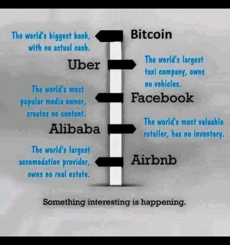
It got me into thinking. What If? We design a marketplace app specifically for budget shoppers for the toys and accessories market.
My fixation with second-hand products began quite early on during my childhood. Growing up as the youngest, I was accustomed to receiving hand-me-downs whether it was clothing, gadgets my siblings wanted to upgrade. My home felt like a constantly replenishing thrift store whenever my siblings opted for new upgrades.
The goal was to create a peer to peer platform where items purchased for kids that would otherwise be thrown away after a few years of use could be resold to other users looking to save money. A secondary goal was to provide inspiration and ideas for parents on what to shop for when looking for items for their kids.
Think “Facebook Marketplace meets Pinterest.”
My job:
Start at ground zero and turn the idea into a completed High-Fidelity prototype through research, design, and testing.
overview:
To ensure the product meets the customer needs and expectations also on top of that it solves the root problem, I asked three important questions
1) who is this for?
2) what problem are we solving?
3) what do we want to achieve?
Who is this for?
Defining the User
Let’s start with some personas
Through research, I created profiles for two ideal users, capturing their needs, demographics, use cases, and potential solutions to address their challenges.
What's their story?
We paired each persona with a user story to come up with an idea of how each user would discover and engage with the app. Admittedly, these were guesses, but it was good groundwork to get our minds thinking of how we could win over these users and what would get them to engage and return to the app.
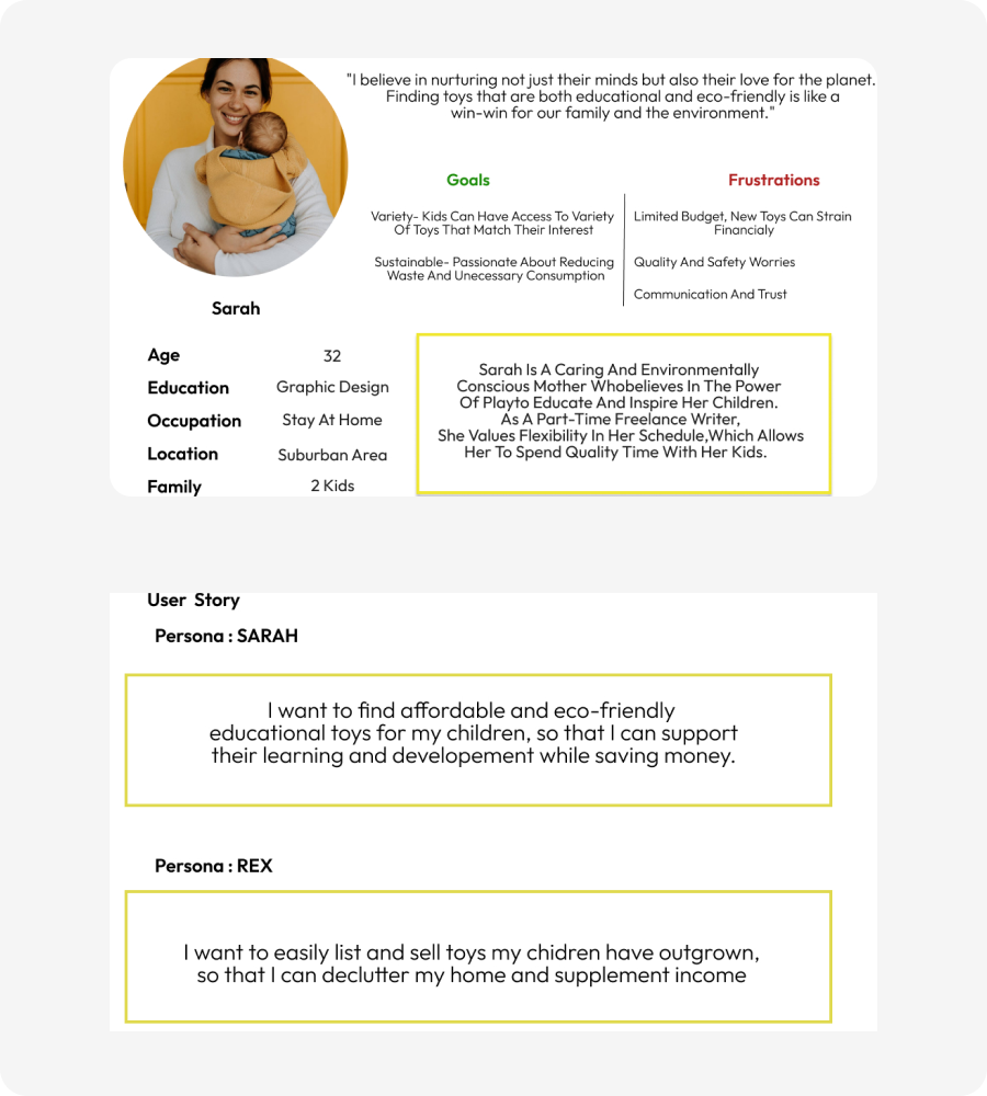
Above, you’ll find images of two user profiles and stories we worked with.
What problem are we solving?
Parents often struggle to find an eco-friendly solution for the disposal of gently-used toys, as kids outgrow them. Despite their best intentions, children lose interest in their toys, leading to wastage. The challenge is twofold – finding a sustainable way to dispose of toys and addressing the financial strain on parents who continually invest in new items as their children grow.
What do we want to achieve?
I aim to develop a product that simplifies the process of buying and reselling toys, creating a user-friendly platform. The objective is to assist parents in not only finding an environmentally aware solution for used toys but also making the overall experience enjoyable while ensuring budget-friendly choices for both parents and children.
Validating Our Guesses
Time for a survey!
Personas are useless if they are not backed by real data about real users, so I decided to do some field research to validate our assumptions about the users and sent a survey to over 15 Parents who were identified to be in our target demographic. Some were my relatives, and I found the others myself through social media and friends.
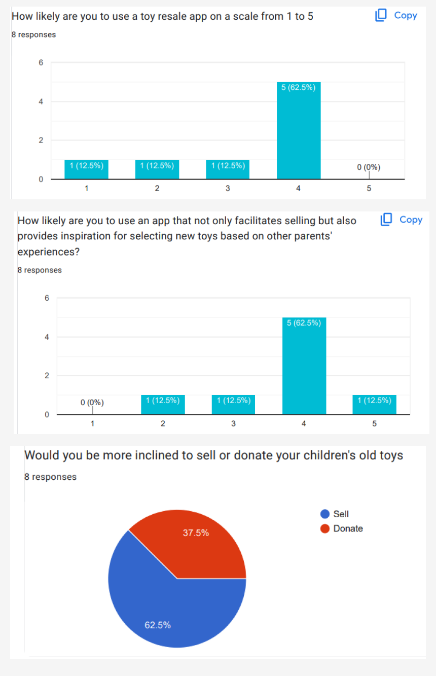
We sent a survey to over 10 parents to verify assumptions about our users.
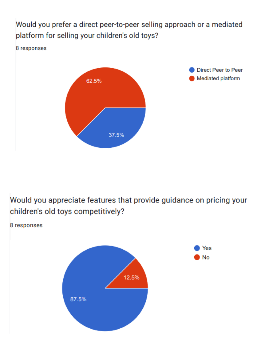
Questions were asked about how old they were, what their average income is like, what their pain points were when shopping for kids items, if they considered buying used items at the time, etc.
We were able to validate that the demographic information and pain points we hypothesized were correct, and that the target base was open to using a product like this.
Results and Deliverables
Concept Development, Sketches, User experience, User Interface, Product Mockups, and an interactive high-fidelity prototype which includes dozens of fixes to problems found during research to speed up and improve the interaction.
Status
Finished. Awaiting development to start and for the final launch to test results.
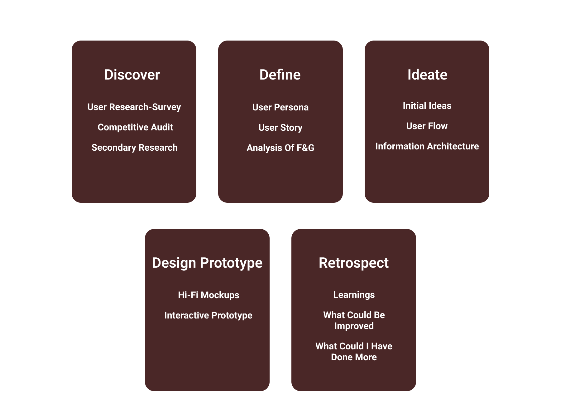
Design Process
Competitive Audit

Each competitor was analyzed screen by screen.
The marketplace space is competitive and there are several huge names that this app would be competing against in the peer-to-peer resale market.
I chose three that I deemed to be industry leaders to analyze. I went through each major screen and captured what I liked and didn’t like about it. Through this exercise, I was able to identify areas that we could learn from, as well as areas that we could improve on in our app.
Direct Competitors: Uptot, Toycycle, Prehugged (website only)
Indirect Competitor: OLX (app and website). Special focus on OLX’s Information Architecture for insights. Merged personal observations with user perspectives from Google reviews to uncover prevalent issues.
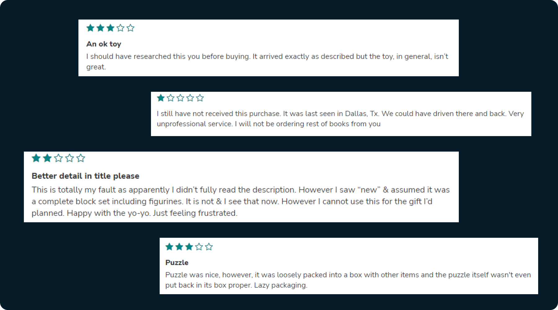
Some snapshots of reviews from the parents who are using these applications.
“Your most unhappy customers are your greatest source of learning.”
Also, here is an UX article I read for this casestudy: Mobile e-commerce search and navigation by Baynard Institute
Information Architecture
To define the navigation, content and user flows.
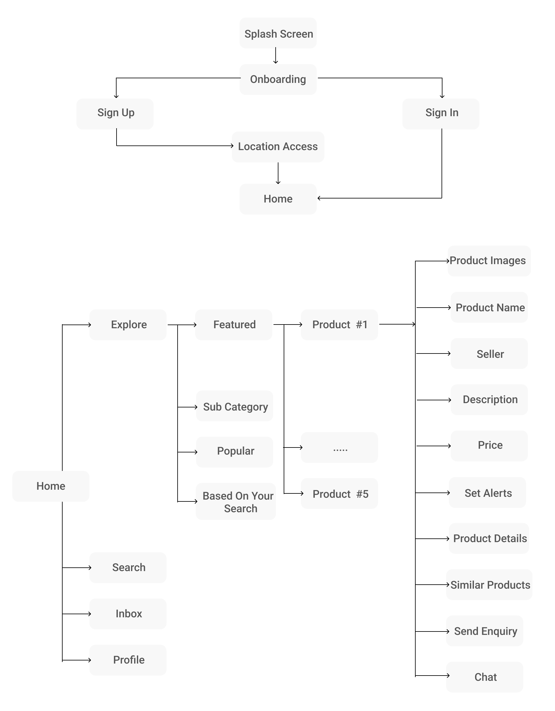
The content of each screen was considered and mapped out.
Sketching and Wireframing
Early Sketching
Quick and Dirty
The entire app was not sketched out in full, but all of the main screens were sketched and iterated on to pave the way for our wireframes.
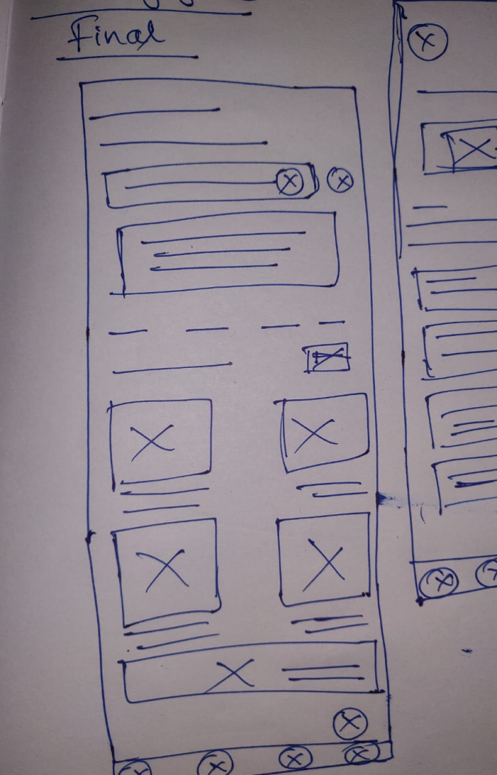
Low-fidelity sketches allowed for quick ideation.
High-fidelity Mockups
Onboarding Process
Now, let me explain how I crafted a shape to the App.
The purpose of onboarding is Feature Promotion, so I made sure the app’s benefits are conveyed to the user as soon as they open the app. I created the illustrations to be self-explanatory so as to catch the users attention, who are habituated to skim through the text.
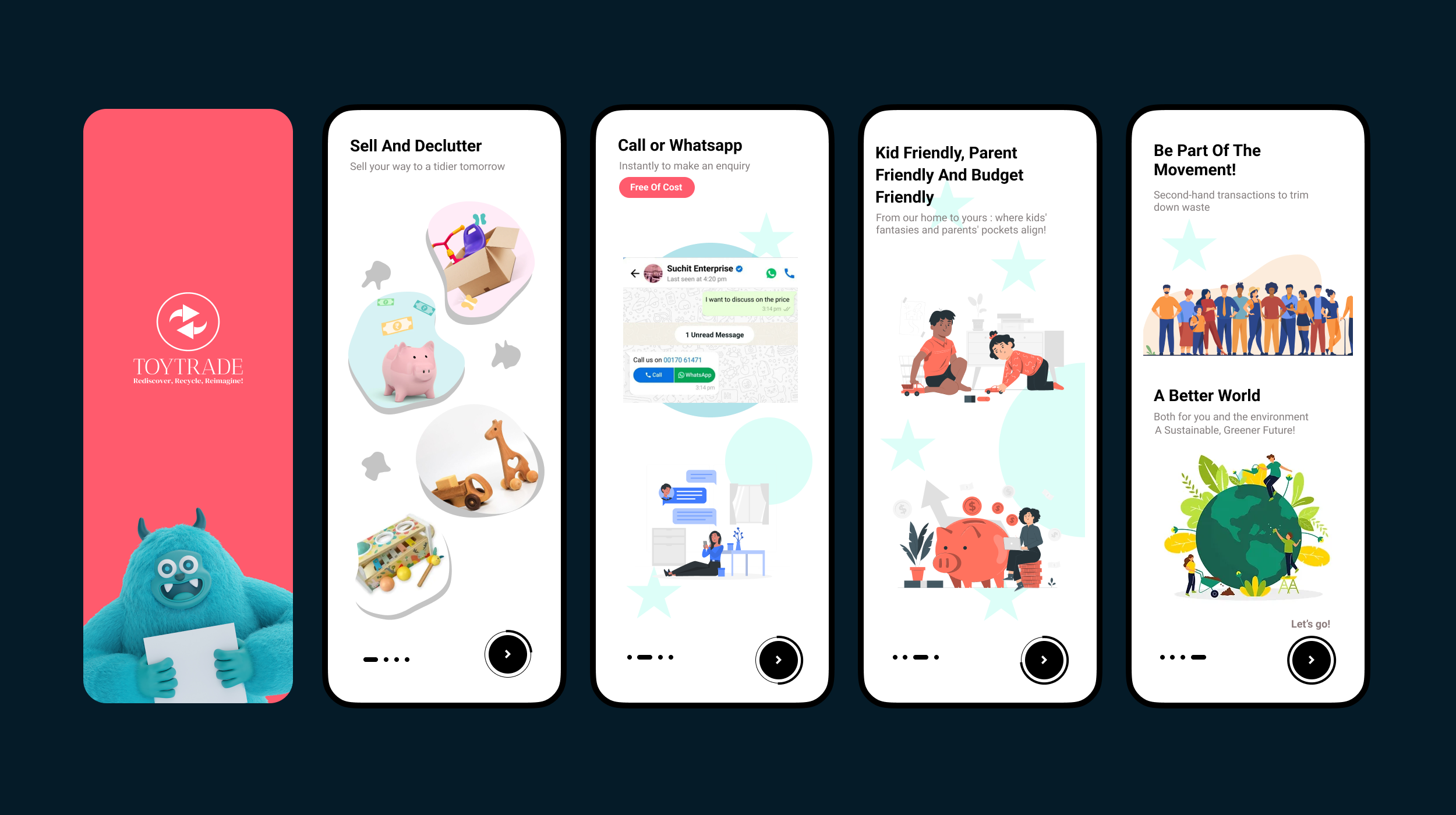
Users are primarily drawn to products and content, making it strategic to include a “skip” Call-to-Action (CTA). So it’s wise to add CTA for Explore, providing an escape hatch for users through guest login. Users can start with a guest session.
Log-in will get reintroduced once you are ready to Post/Enquire about ads. A limited number of onboarding screens, followed by the ability to skip them altogether.
Login & Sign Up
Initially, I dropped Mobile Login option. However after further research, I realized it’s more convenient for users as they don’t need to remember a password.
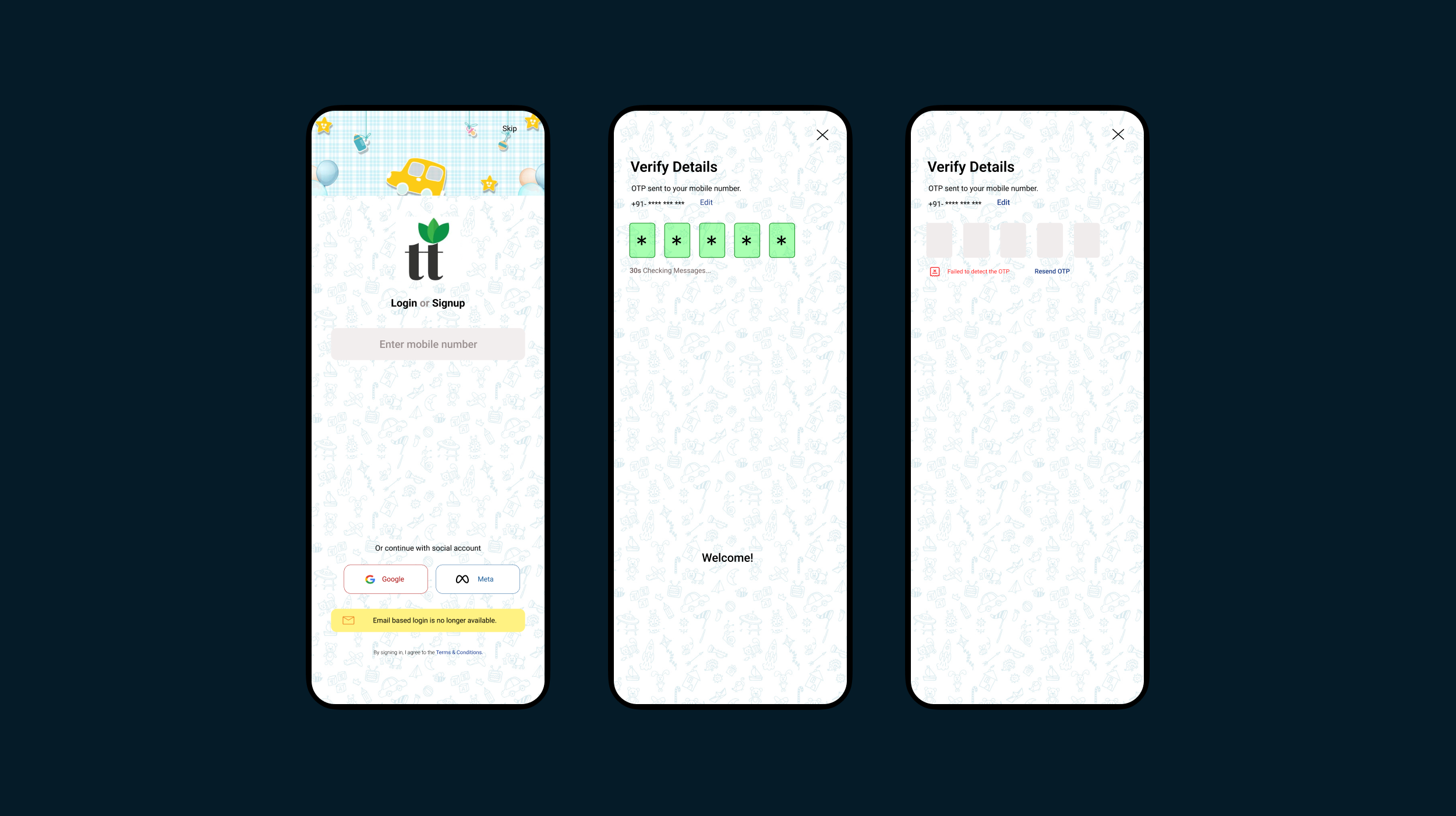
Ensuring clarity with error messages is crucial, Hate those “Your username or Password is wrong”
Home Screen
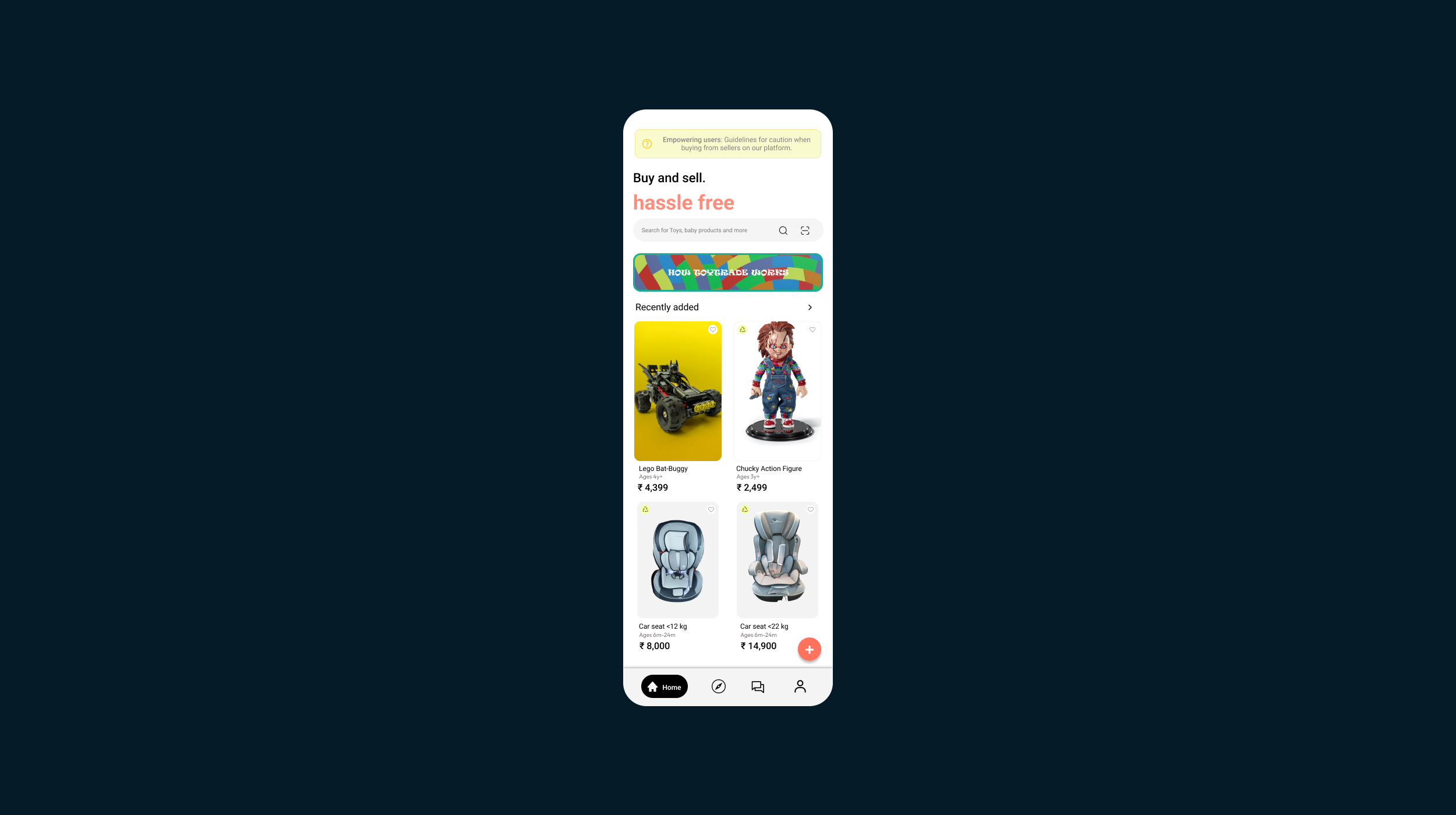
The guidelines for pricing and photography gives a trustworthy and transparent environment for sellers. This ensures a positive selling experience and builds credibility for the platform.
The disclaimer articles emphasize our commitment to transparency, ensuring customers feel informed and satisfied. This builds trust between buyers and sellers, making the platform a reliable place for transactions.
Explore page
Three questions users ask when they are exploring
“Where am I?”
“How did I get here?”
“How I get to [x]?”
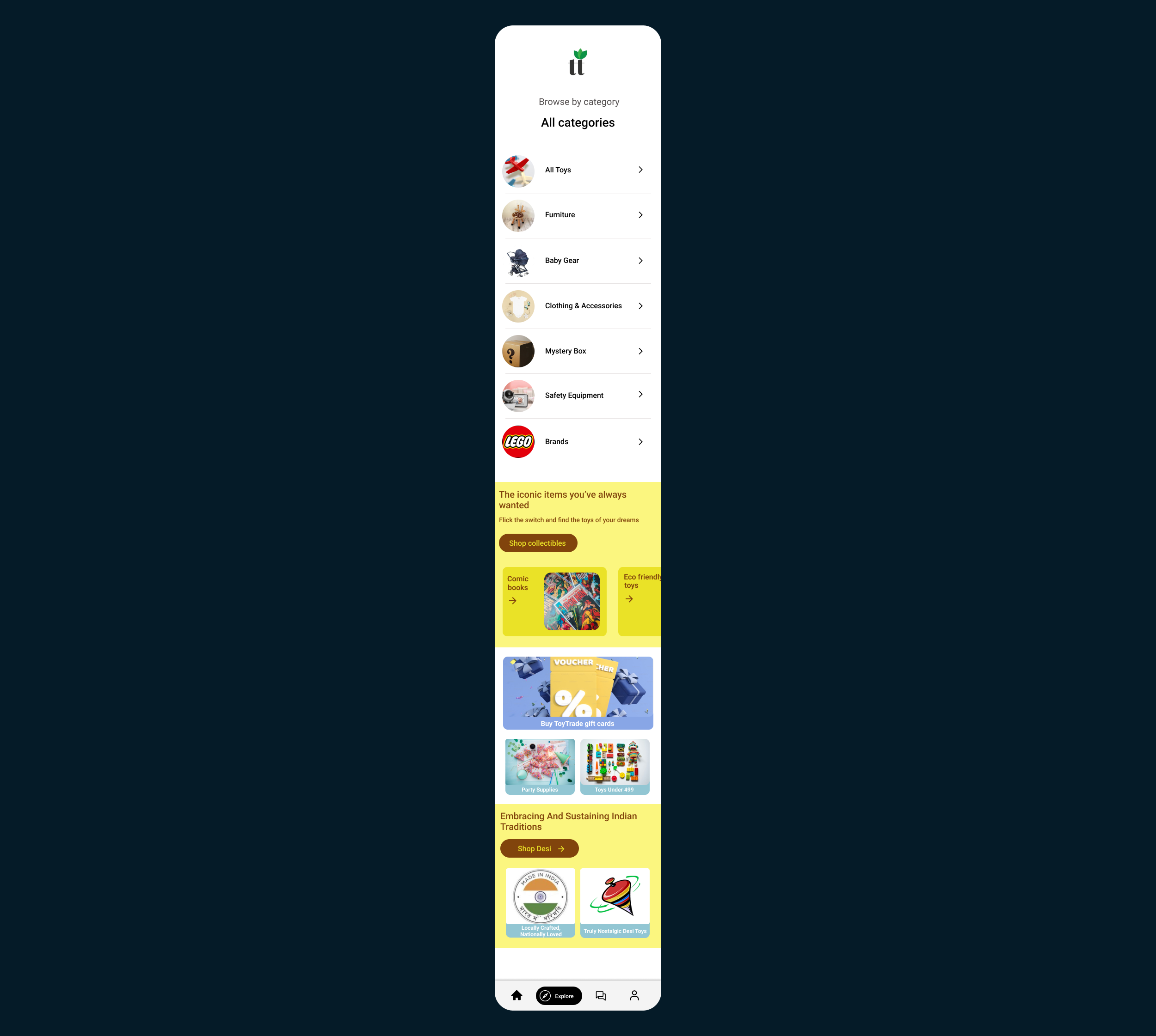
What I did…
Ensuring users where they are in the site hierarchy by adding header to the page, making it easy to follow and get a broader scope when necessary.
Organized Product Discovery:
Introduction of categories streamlines user navigation, making it easier for buyers to find specific products of interest, hence simplifying product discovery. This strategic approach enhances the overall appeal and functionality of the Explore Page.
Promotional Incentives:
Vouchers and gift cards contribute to the platform’s marketing strategy, improving customer loyalty and encouraging engagement.
Product Details Screen
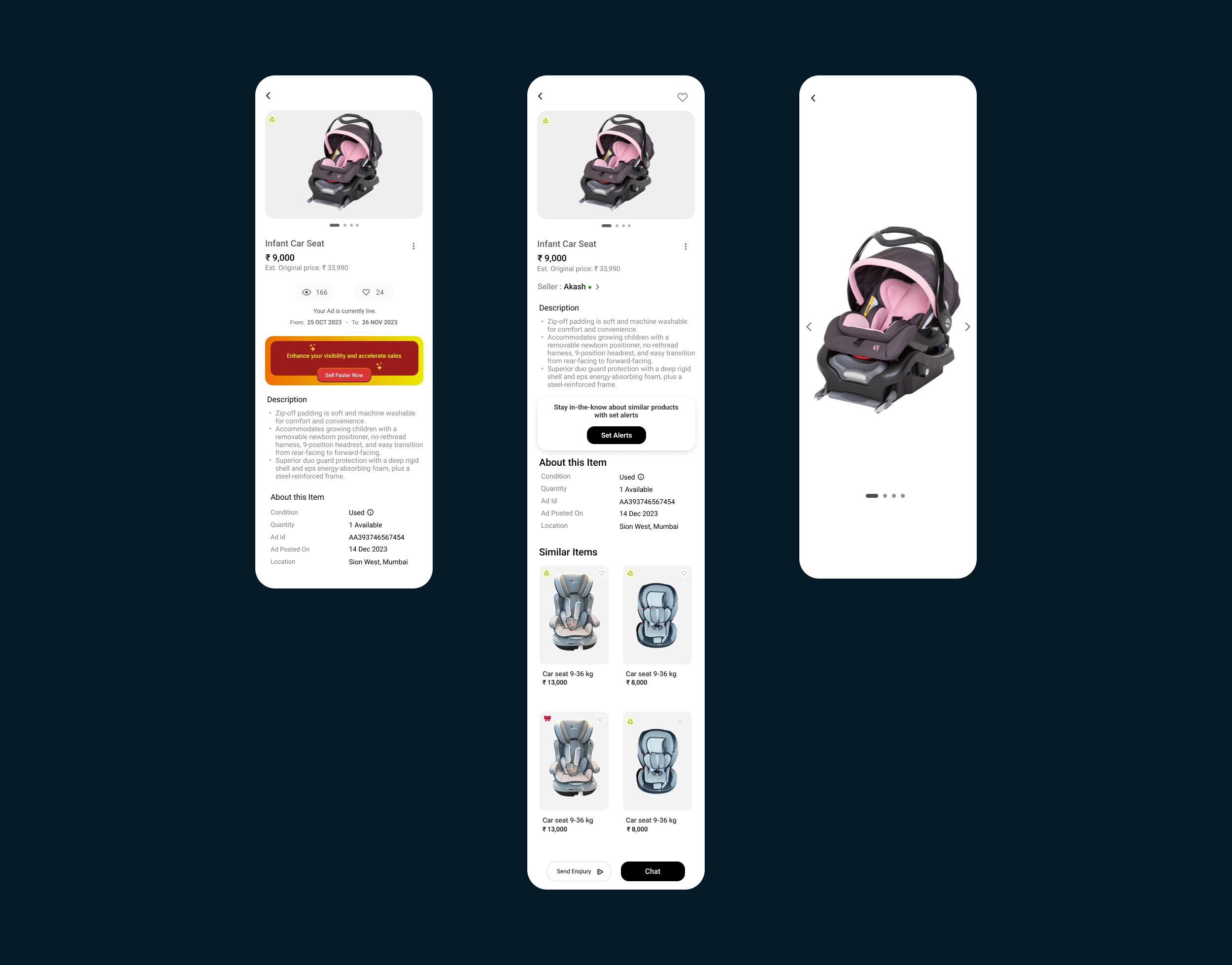
Product page has plentiful information, which is hard to articulate easily.
So how can I…
Help them quickly ponder upon which product to choose?
Help them choose a product that fits best in their interest?
Like any other e-Commerce products, customers can view details such as Product name, brand or seller name, location, price, offer applicable and description. The seller will have the flexibility to choose whether the product price can be negotiable or not.
Customers can contact the seller by call or chat. Directions are also provided to visit in-person.
If a customer chooses to negotiate on a particular product, clicking on the enquire option will open a chat screen with a preloaded message allowing users to conveniently edit and propose their desired price. Once an enquire request is made, seller will receive the request. Customer can wait until
the seller responds.
About seller page has a brief overview of that seller, which can also help users determine its credibility.
Search Section
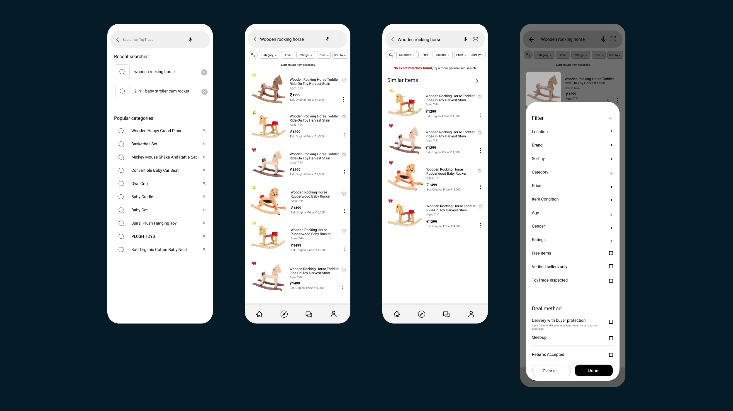
Search works best when the user has a brief idea of what they are looking for. If there is no result to show, the user ends up on a dead-end. So I thought of adding relevant search results for a search term.
I’ve introduced a more specialized set of filters, specifically designed for children’s products, including options such as age and gender. These filters cater to the unique requirements of parents, ensuring a more tailored and efficient shopping experience.
Other screens
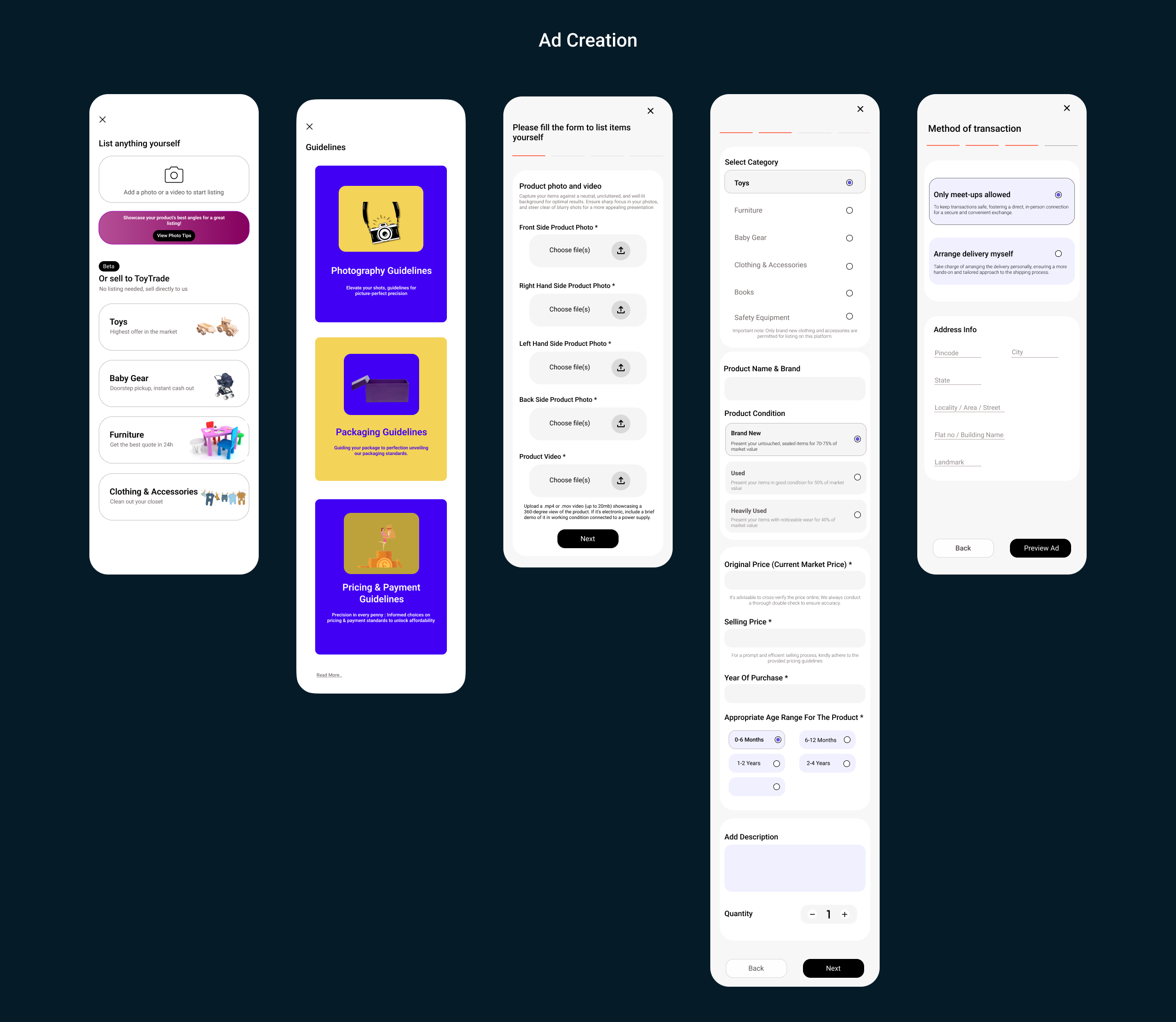
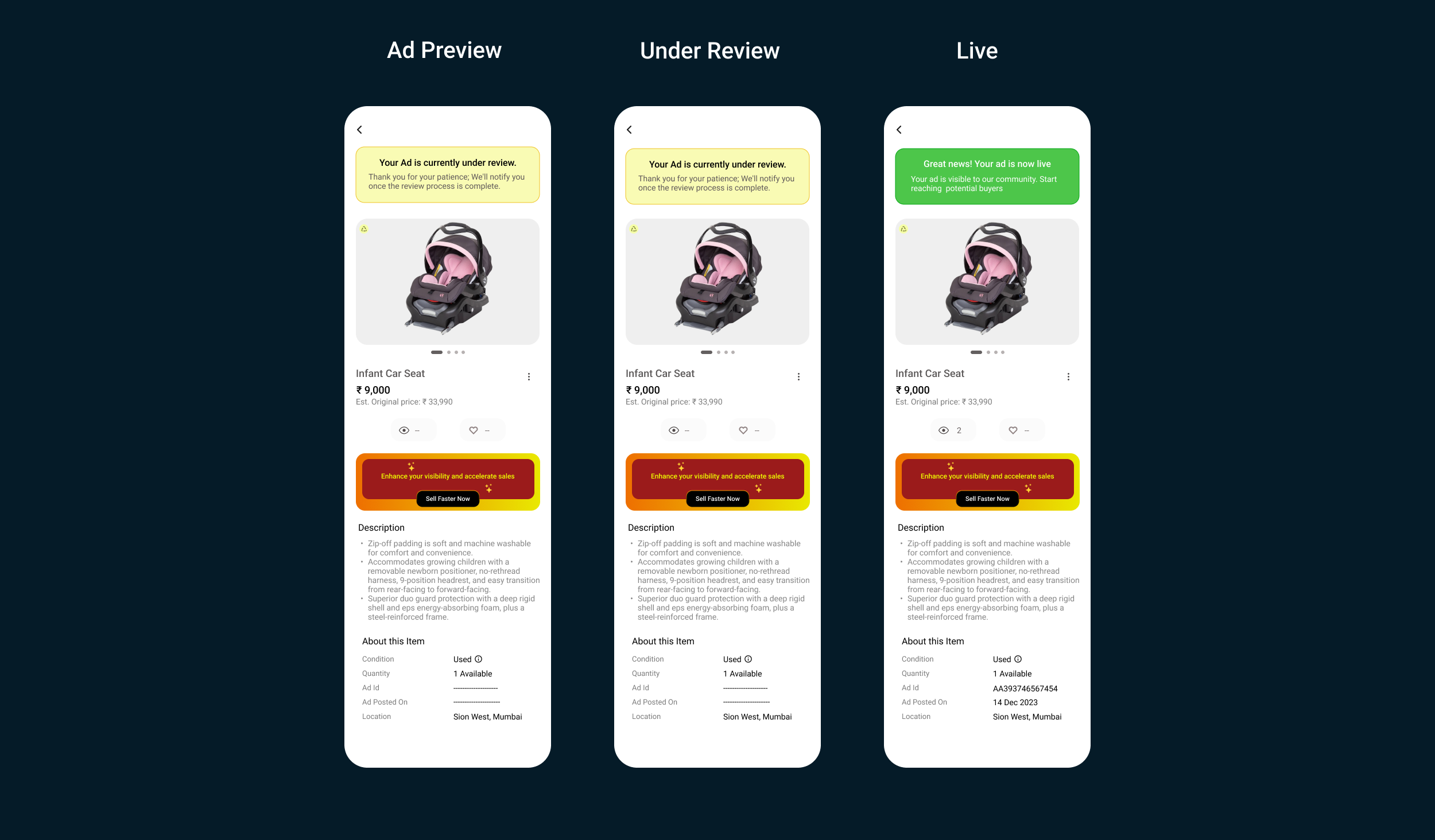
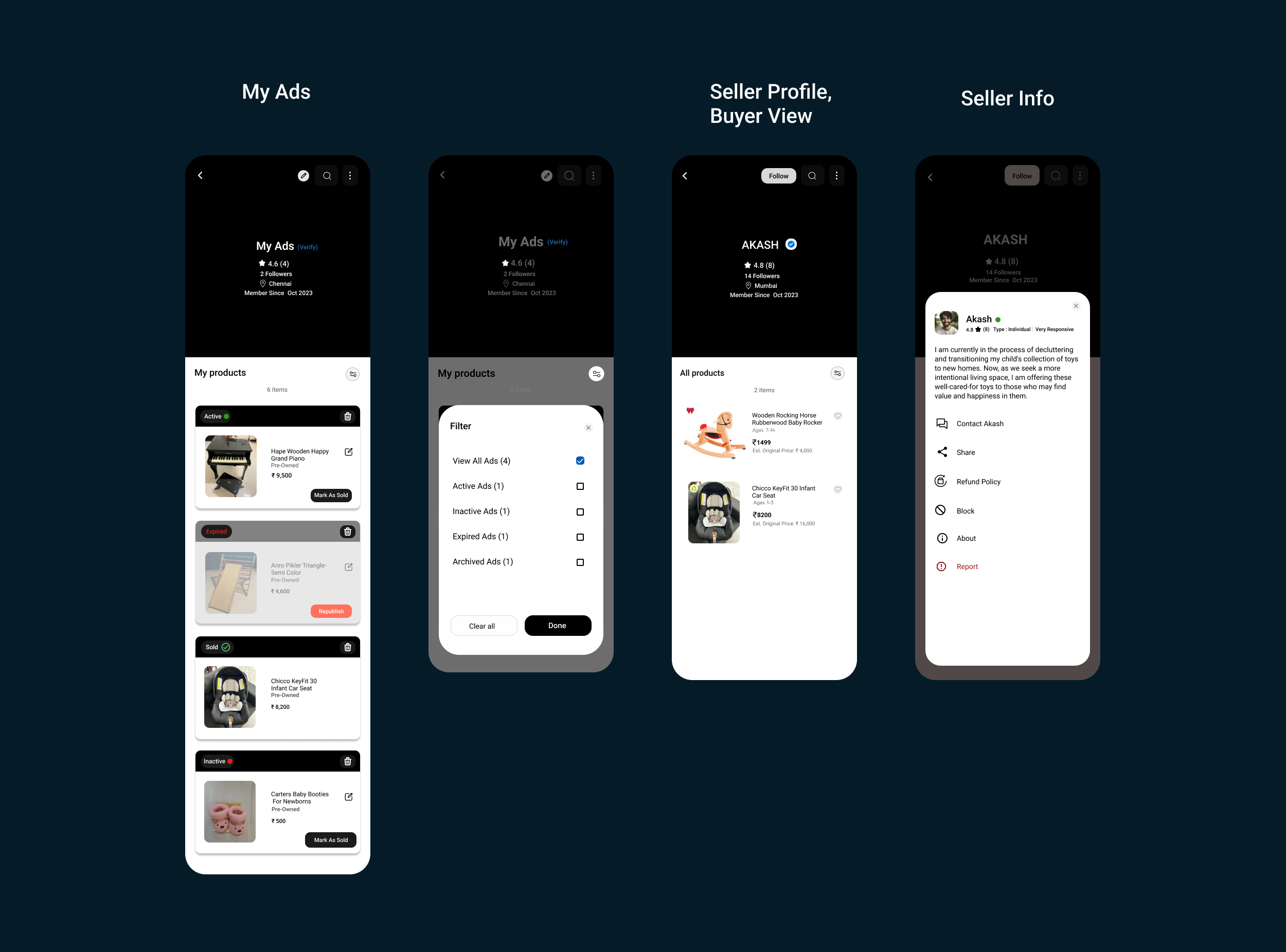
More Testing

You can never test too much.
Testing the final prototype
Just to be safe
The final prototype was created with a polished UI and once again tested to ensure the quality of the UX was not compromised.
Two iterations were completed with minor tweaks in the design to eliminate all areas of concern or confusion with the users.
Once completed, the final prototype and design was ready to be developed
Retrospectives
What I learned,
It was an interesting and challenging project for me, as I had to figure things out all by myself, as freelance product designer. From defining the structure, to creating engaging user flows, to creating attractive illustrations, I enjoyed every bit of it.
My knowledge has definitely improved from when I started this project by the time I wrapped it up. I came to understand that product design is a process that involves a cycle of feedback and iteration to refine and improve the design.
While this app may not revolutionize the world, its focus on enhancing the resale of used products aligns with my commitment to contributing to a more sustainable environment.
What could I have done if I had more Time,
To address more usability and accessibility issues, I could have conducted usability testing on more consumers.
To illustrate the reasons behind the selection of the colour, typeface, and artwork, I could have created an entire design system.
The application could have been more detailed in terms of architecture to build a few additional screens.
In conclusion, I was able to take a dream, verify that it can exist, and bring it into reality through research, testing, and design.