Typography
October 18, 2024 · 4 mins ·

Typography plays a huge role in UX design, often more than we realize. It’s not just about picking a nice-looking font—it’s about making sure the text is easy to read, guides users to the right information, and reinforces the overall brand feel. Done right, typography can completely change how someone experiences a website or app.
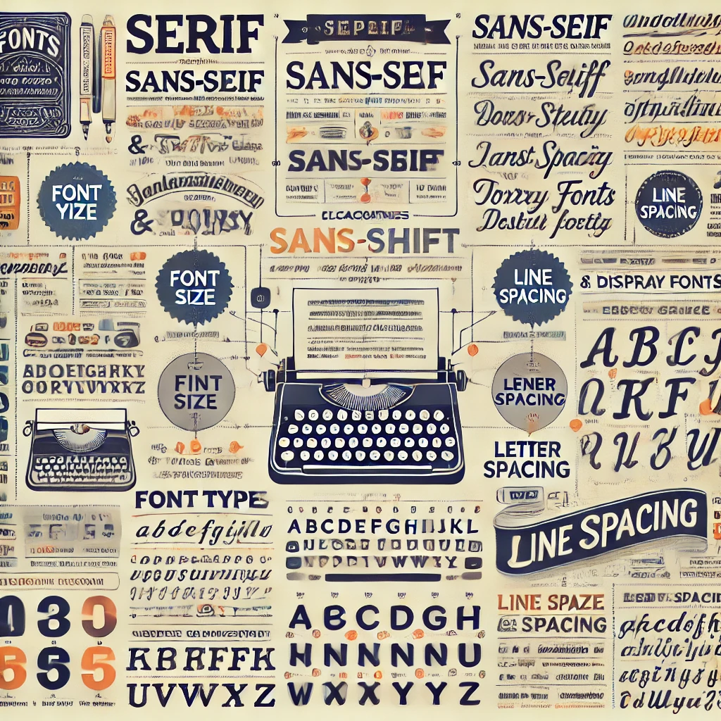
Take fonts, for example. Ever notice how serif fonts (the ones with little lines at the ends of letters) feel more formal or traditional? Think newspapers or legal documents. On the flip side, sans-serif fonts, which are cleaner and don’t have those extra lines, give off a modern, minimalist vibe. It’s a subtle difference, but it can really influence how users perceive the personality of your brand.
Beyond just choosing a font, you’ve got to think about how the text is organized. Creating a clear hierarchy in your typography—by adjusting font sizes, weights, or colors—helps users quickly figure out what’s important on the page. Headings should grab attention, subheadings should guide, and body text should be easy to skim. People don’t read every word online; they scan. Good typography makes scanning effortless.
Another thing to keep in mind is spacing. Ever tried to read something with lines crammed together? It’s uncomfortable. Proper line spacing (or “line height”) makes text more digestible. Similarly, keeping line lengths between 50-75 characters can prevent fatigue while reading. These small adjustments make a big difference in usability.
And let’s not forget accessibility. Your typography needs to be readable for everyone, including users with visual impairments. That means making sure there’s enough contrast between your text and background colors and avoiding overly decorative fonts that might look cool but are tough to read.